5 Pantone Colors Trending in 2024: Stunning Interior Choices
Transform your home with the top Pantone colors of 2024! Explore calming blues, vibrant corals, earthy greens, and more for stylish, fresh interiors.
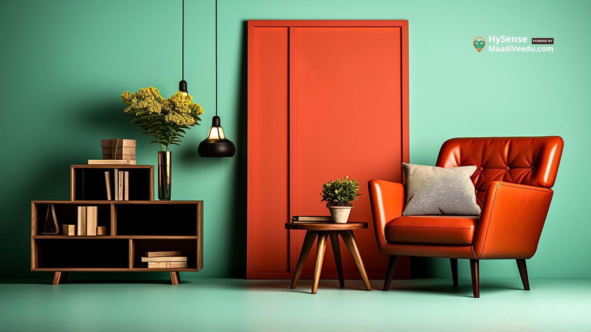
Table of Contents
Introduction
As we step into 2024, the world of interior design is buzzing with fresh ideas, and one of the most exciting updates is the trending Pantone colors for the year. These colors aren't just random picks; they reflect the moods, emotions, and lifestyle shifts of people worldwide. From calming blues to earthy greens, the 2024 Pantone palette offers something for everyone, whether you love bold statements or subtle sophistication. In this blog, we’ll explore the top five trending colors for 2024 and share simple, practical tips on how you can incorporate them into your home.
1. Tranquil Blue: Pantone 19-4052
Why Tranquil Blue is Trending
Tranquil Blue is like a breath of fresh air. Think of the peaceful feeling you get when you look at a clear sky or a calm ocean—this color captures that serenity. As life gets busier and more stressful, people crave colors that bring calmness and balance into their homes. Tranquil Blue is perfect for creating spaces where you can relax and recharge.
How to Incorporate Tranquil Blue
- Walls: Painting a feature wall in Tranquil Blue can instantly make a room feel more spacious and calming.
- Furnishings: Add blue throw pillows, curtains, or a cozy rug to subtly introduce the color without overwhelming the space.
- Color Pairings: For a soft, elegant look, pair Tranquil Blue with neutral shades like beige or white. If you want something more vibrant, mix it with coral or mustard for a trendy yet balanced contrast.
2. Vibrant Coral: Pantone 16-1546
Why Vibrant Coral is Popular
If you’re looking to add energy and warmth to your home, Vibrant Coral is your go-to color. It’s cheerful, uplifting, and full of life, making it perfect for spaces where people gather, like the living room, kitchen, or dining area. In a time when many are prioritizing positivity and connection, this color stands out as a favorite.
How to Use Vibrant Coral
- Accessories: Brighten up your room with coral throw pillows, vases, or even a piece of bold wall art.
- Furniture: A statement coral chair or sofa can become a stunning centerpiece in any room.
- Blending Colors: Vibrant Coral pairs beautifully with soft greys, whites, and even earthy tones like olive or tan. Use these combinations to balance the brightness and keep your decor cohesive.
3. Earthy Sage: Pantone 15-0319
Why Earthy Sage is Trending
Earthy Sage reflects a growing love for all things natural and sustainable. This muted green tone is inspired by the beauty of nature, and it brings a sense of calm and balance into any space. As more people focus on eco-friendly living, colors like Earthy Sage have become a popular choice for interiors that feel grounded and serene.
How to Incorporate Earthy Sage
- Wall Colors: Paint an entire room or just an accent wall in this soft green to create a refreshing and inviting atmosphere.
- Natural Materials: Combine Earthy Sage with wooden furniture, woven baskets, and stone textures to enhance the natural vibe.
- Soft Furnishings: Sage-green curtains, bedspreads, or sofa covers can tie the room together while keeping it light and airy.
4. Warm Sand: Pantone 14-1116
Why Warm Sand is a Top Choice
Warm Sand is like the comforting embrace of a sunny day at the beach. This soft, neutral beige is perfect for creating a cozy and relaxed ambiance. It’s versatile and works well in almost any room, blending seamlessly with other colors. Its simplicity makes it ideal for anyone who loves a clean, modern aesthetic with a touch of warmth.
How to Use Warm Sand
- Walls: Use Warm Sand as a base color for walls to make your room feel brighter and more spacious.
- Furniture: Beige sofas, chairs, or ottomans in Warm Sand can create a cozy, timeless look.
- Layering with Colors: Pair Warm Sand with bolder shades like navy blue, emerald green, or burnt orange to add depth and contrast. Adding metallic touches like gold or brass can also elevate the space, giving it a luxurious feel.
5. Bold Magenta: Pantone 18-2624
Why Bold Magenta is Making Waves
If you love making a statement, Bold Magenta is the perfect choice for you. This striking color is all about energy, creativity, and confidence. It’s ideal for adding personality to your space, whether you use it in small accents or go big with a feature wall. Bold Magenta is not for the faint-hearted, but when used thoughtfully, it can transform any room into a vibrant masterpiece.
How to Incorporate Bold Magenta
- Feature Walls: Create a show-stopping accent wall in Bold Magenta for a dramatic effect.
- Accessories: If you prefer subtlety, add magenta throw pillows, picture frames, or vases for just a touch of color.
- Balancing Act: Pair Bold Magenta with neutral tones like grey, beige, or white to soften its intensity. Alternatively, combine it with deep greens or blues for a daring, luxurious look.
Conclusion
The Pantone Colors of 2024 are a blend of calm, vibrancy, and timeless elegance, offering something for every style and mood. Whether you’re drawn to the peaceful vibes of Tranquil Blue, the lively energy of Vibrant Coral, or the grounding tones of Earthy Sage, these colors can transform your home into a space that feels both stylish and personal.
Incorporating these trends doesn’t have to be complicated. Start small with accessories or go bold with walls and furniture—the choice is yours! By embracing these stunning Pantone colors, you’ll not only refresh your home but also create an environment that reflects your personality and the trends of 2024.
Stay inspired and explore more creative ideas to elevate your home decor—click here for exclusive design tips and daily updates!